Logo guidelines · v1.0 · November 2026
The S, and how to use it
Logo versions, construction, colour, type and the few rules that keep the Soluease logo recognisable everywhere it goes. This page is the standard: every logo file, app icon and lockup follows it.
Get the logo files 01The idea 02Construction 03Logo versions 04Clear space & size 05Colour 06Typography 07Misuse 08Files
01
The idea
Soluease is solution and ease in one word. The logo says it with one letter.
An S on an app-icon tile, because apps and games are what we make. Two soft bowls keep it friendly; two sharp cuts at 15° lean it forward, like it's already on its way. It's one flat white shape on one flat cyan tile, so it holds up from a 16 px browser tab to a booth banner.
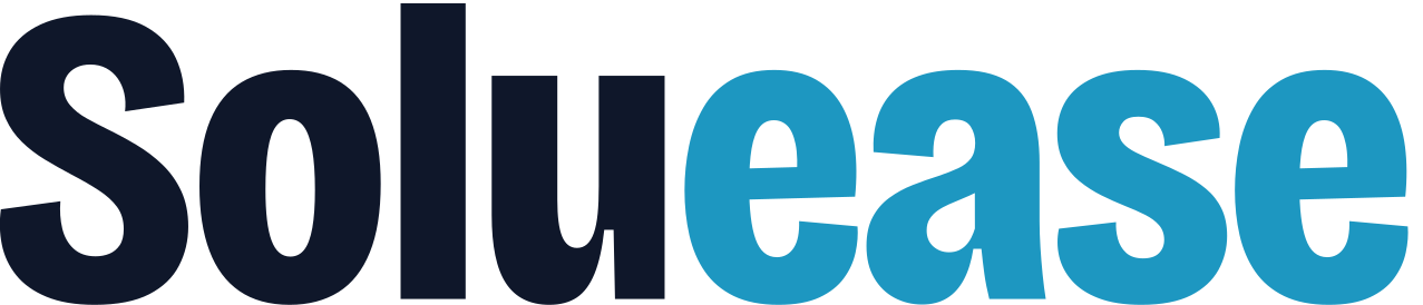
The wordmark splits the name the same way: Solu in ink, ease in cyan, so it always reads as a promise: software made easy.
02
Construction
X-ray · 512 grid
- Grid
- 512 × 512 units, 32-unit modules
- Tile
- Corner radius 143.36 (28%)
- Upper bowl
- Ellipse 181 × 131, centre C1 (271, 215)
- Lower bowl
- Ellipse 190 × 148, centre C2 (242.5, 286.5)
- Cuts
- 15° from vertical, leaning right. A through (306, 256), B through (198, 256): 108 apart
- Key points
- P1 330.25, 165.49
P2 311.46, 235.61
P3 175.72, 339.14
P4 198.49, 254.19 - S bounds
- 161.78 × 211, centred on the tile to within 1 unit
- Safe zone
- Circle Ø240 (47% of the tile). Any mask that keeps it whole keeps the S whole
- Lockups
- Horizontal: type 0.75 T, gap 0.2 T. Stacked: type 0.5 T, gap 0.125 T. T is the tile's height
These numbers are the standard every logo file is drawn from. Use the files in Files rather than redrawing; if the logo ever has to be rebuilt, rebuild it from these numbers.
Build it in four steps
SVG path of the S, 512 artboard
Click to copy
03
Logo versions
Use the horizontal lockup by default. Switch only when the space calls for it. Every version comes in full colour, reverse and one-colour files (see Files).
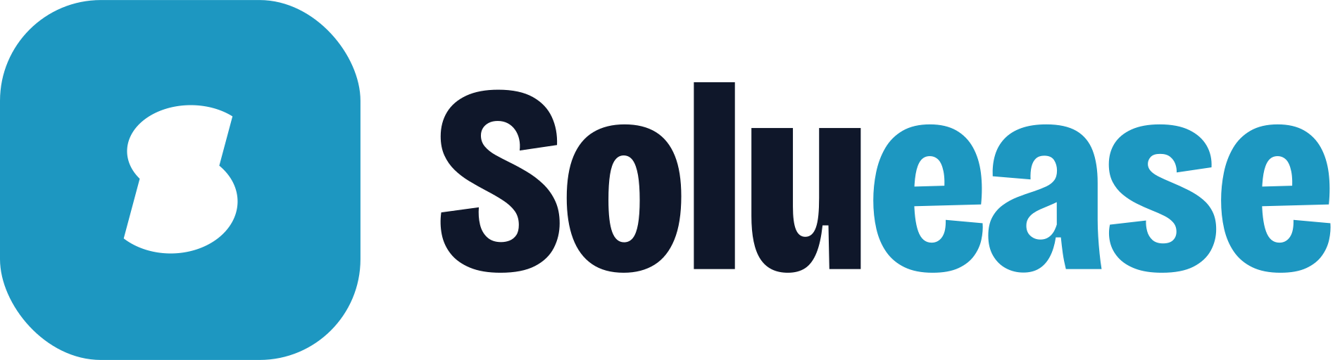
Primary · Horizontal
The default. Website headers, documents, slides, email signatures, store banners.
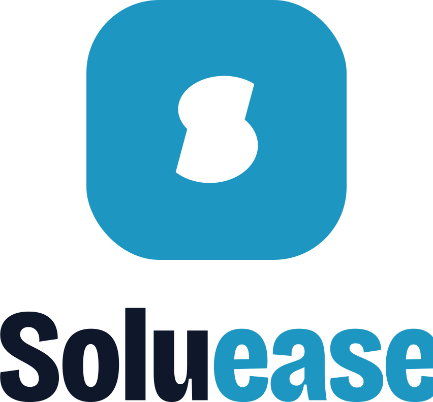
Stacked
For square spaces. Splash screens, the site intro, posters, merch, social posts.

Logomark
The tile on its own, once the name is known. Favicons, chat avatars, loading screens.

App icon
A full-bleed square for store listings, launcher icons and social avatars. Platforms apply their own mask.
Wordmark
Where the tile won't fit or would be too small to read: credits, footers, partner logo strips.
04
Clear space & size
x = half the tile's height. Keep x clear on every side. Text, UI, other logos and the edge of the screen all stay outside the dashed line. The same goes for the stacked lockup, the logomark and the wordmark (measured from its cap height).
Minimum size
| Version | Screen | |
|---|---|---|
| Horizontal lockup | 120 px wide | 30 mm |
| Stacked lockup | 80 px wide | 20 mm |
| Wordmark | 80 px wide | 20 mm |
| Logomark | 24 px | 8 mm |
| App icon | 16 px | – |
Below these sizes the cuts close up and the wordmark's counters fill in. At actual size:
120 px
48
32
24
16
05
Colour
Three colours make the logo: cyan, ink and white. Paper and mist are the grounds it sits on most. Click a HEX value to copy it.
Brand cyan
The tile and "ease". Big moments and calls to action.
- HEX
- RGB
- 29 151 193
- CMYK
- 85 22 0 24
Ink
"Solu", type and one-colour logos. Use it instead of pure black.
- HEX
- RGB
- 15 23 42
- CMYK
- 64 45 0 84
White
The S, and the wordmark in reverse.
- HEX
- RGB
- 255 255 255
- CMYK
- 0 0 0 0
Paper
Light ground. The site, documents and decks.
- HEX
- RGB
- 243 248 250
- CMYK
- 3 1 0 2
Mist
Soft ground for panels and highlights. Never in the logo.
- HEX
- RGB
- 220 240 247
- CMYK
- 11 3 0 3
CMYK values are straight conversions from RGB, a starting point only. Proof them on your paper before a print run.
Balance
Share of a typical layout
Paper gives everything room, ink does the talking, cyan carries the big moments. Mist only ever plays a small part.
Approved pairings
Logo contrast stays at 3:1 or more

06
Typography
Two free Google Fonts. Bricolage Grotesque is the wordmark's typeface and does the shouting; Instrument Sans does the reading.
Bricolage Grotesque
Display and wordmark. Headlines, titles, statements. ExtraBold 800, condensed to 78%.
Google Fonts ↗Press start to ship
Instrument Sans
Text. Body, UI, buttons, labels. Regular 400, Medium 500, SemiBold 600.
Google Fonts ↗Body copy sits in Instrument Sans at 16 px with a 1.6 line height. It stays calm and readable next to a loud cyan tile, on the site, in proposals and in app screens.
System mono
Data. HEX codes, file names, coordinates, version numbers. Whatever the platform provides.
#1d97c1 · v1.0 · P1 330.25, 165.49
Scale
| Role | Face | Size / line | Sample |
|---|---|---|---|
| Hero headline | Bricolage 800, caps | 144 / 0.84 | Hello |
| Section title | Bricolage 800, caps | 128 / 0.82 | Our work |
| Statement | Bricolage 700 | 72 / 1.02 | Built to last. |
| Body | Instrument Sans 400 | 16 / 1.6 | Clear milestones and regular demos. |
| Eyebrow | Instrument Sans 600, caps | 12, +0.16em | Case study |
Sizes are desktop maximums; headlines scale down with the screen. The name in the logo is supplied as outlines: never type "Soluease" in Bricolage Grotesque as a stand-in for the logo in artwork, slides or documents. Place a wordmark or lockup file instead.
07
Misuse
Don't
stretch or squash it. Scale with the proportions locked.
Don't
rotate it. The tilt is saved for motion, like the site intro.
Don't
swap or change the colours. Cyan tile, white S, always.
Don't
change the corners. They're 28%, or square in the app icon.
Don't
add outlines, shadows, gradients or glow.
SolueaseDon't
retype the name in another typeface. Place the wordmark file.
SolueaseDon't
swap the ink and cyan halves. It's always Solu in ink, ease in cyan.
Don't
put the cyan tile on cyan. That's 1:1; use the white one-colour logo.
08
Files
All files are SVG, with the wordmark outlined so no font is needed. Click a file name to download it, or copy its code straight from this page.
Horizontal lockup
Stacked lockup

Logomark, wordmark & app icon



Need a PNG? Export one from the SVG at the size you need (1024 px for app stores, for example); never enlarge a smaller PNG. logo.png is a 512 px app icon for tools that can't open SVG.

Regenerate
Every file comes from scripts/build-logo.mjs, which draws the S from the numbers in Construction. Change a colour or a number in it and run:
Need another format, or a lockup this page doesn't cover? [email protected]